Density Estimation
We want to learn about the distribution of the population from which the data were drawn. More specifically, we want to formally estimate the shape of the distribution, i.e. get a “reliable” visual representation such as a histogram.
Histogram
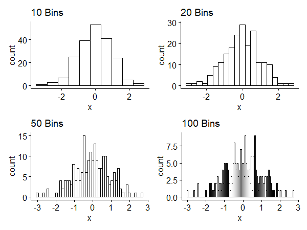
Subintervals of the histogram are called bins. The width of the interval is called binwidth. Small binwidth leads to more bins and shows local details, which may or may not be meaningful. Large binwidth shows a smoother, large-scale picture, but we may lose interesting information. Figure 1 shows histograms of a random sample of size 200 generated from $N(0, 1)$1. We have a tradeoff between competing goals.
The histogram has some drawbacks:
- Histograms are not smooth even if the underlying distribution is continuous - binning discretizes the result.
- Histograms are sensitive to the choice of the class interval.
- (related) Histograms depend on the choice of endpoints of the intervals. Both 2 and 3 are about the visual appearance.
Kernel density estimation
A smoother approach which gets around some of the drawbacks of the histogram is called kernel density estimation. It gives a continuous estimate of the distribution. It also removes dependence on endpoints, but the choice of binwidth (drawback 2) has an analogous issue here.
Procedure
For any $x$ in a local neighborhood of each data value $x_i$, fitting is controlled in a way that depends on the distance of $x$ from $x_i$. Close-by points are weighted more. As the distance increases, the weight decreases.
The weights are determined by a function called the kernel, which has an associated bandwidth. The kernel, $K(u)$, determines how weights are calculated, and the bandwidth, $\Delta$ or $h$, determines scaling, or how near/far points are considered “close” enough to matter.
Let $\hat{f}(x)$ denote the kernel density estimator of $f(x)$, the PDF of the underlying distribution. $\hat{f}(x)$ is defined as
$$ \hat{f}(x) = \frac{1}{n\Delta} \sum\limits_{i=1}^n {K\left(\frac{x-x_i}{\Delta}\right)} $$
where $n$ is the sample size, $K$ is the kernel, and $x_i$ is the observed data.
To be called a kernel, $K(\cdot)$ has to satisfy certain properties: $K(\cdot)$ is a smooth function such that
$$ \begin{cases} K(x) \geq 0 \\ \int{K(x)dx} = 1 \\ \int{xK(x)dx = 0} \\ \int{x^2K(x)dx > 0} \end{cases} $$
The first two constraints make it a density, and the second set of constraints ensures it has mean $0$ and has a variance.
Commonly used kernels
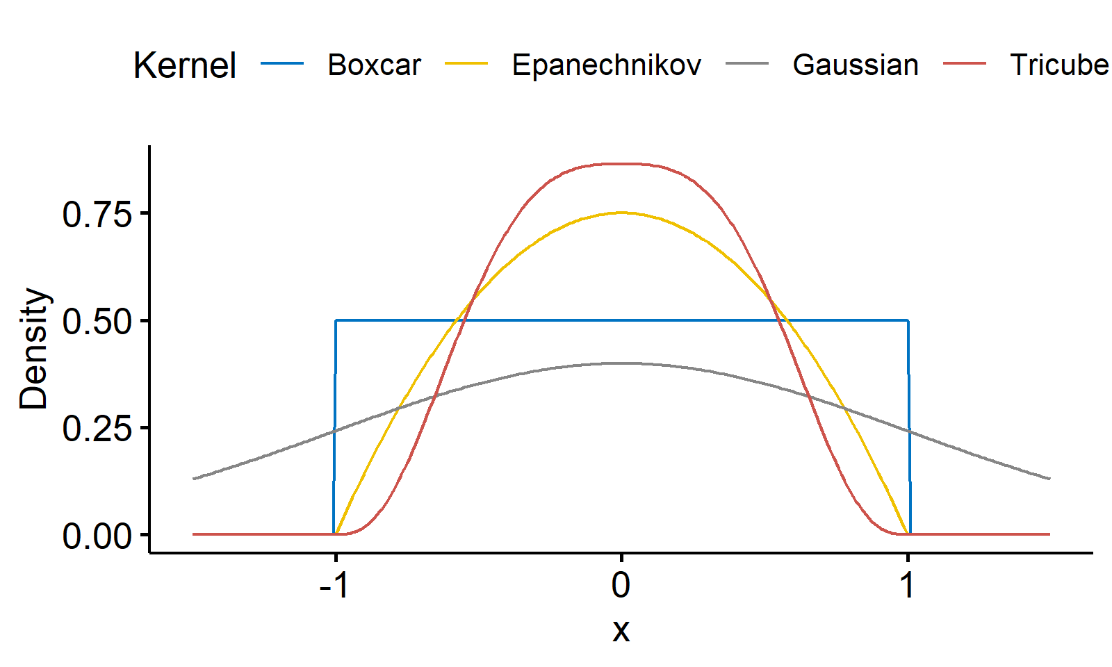
Here we give four commonly used kernels2.
The boxcar kernel can be expressed as a uniform distribution
$$
K(x) = \frac{1}{2}\mathbf{I}(x)
$$
The Gaussian kernel
$$ K(x) = \frac{1}{\sqrt{2\pi}}e^{-\frac{x^2}{2}} $$
The Epanechnikov kernel
$$ K(x) = \frac{3}{4}(1-x^2)\mathbf{I}(x) $$
The tricube kernel is narrower than the previous ones
$$ K(x) = \frac{70}{81}(1 - |x|^3)^3\mathbf{I}(x) $$
In all the formulae above, the indicator function $\mathbf{I}(x)$ is given by $$ \mathbf{I}(x) = \begin{cases} 1 & |x| \leq 1 \\ 0 & |x| > 1 \end{cases} $$ A visualization of the four kernels is given below3.
Bandwidth selection
In practice, the choice of the kernel isn’t that important, but the choice of $\Delta$ is crucial: it controls the smoothness of the kernel density estimator. When $\Delta$ is small, $\hat{f}(x)$ is more “wiggly” and shows local features. When $\Delta$ is large, $\hat{f}(x)$ is “smoother”, same as the binwidth in histograms.
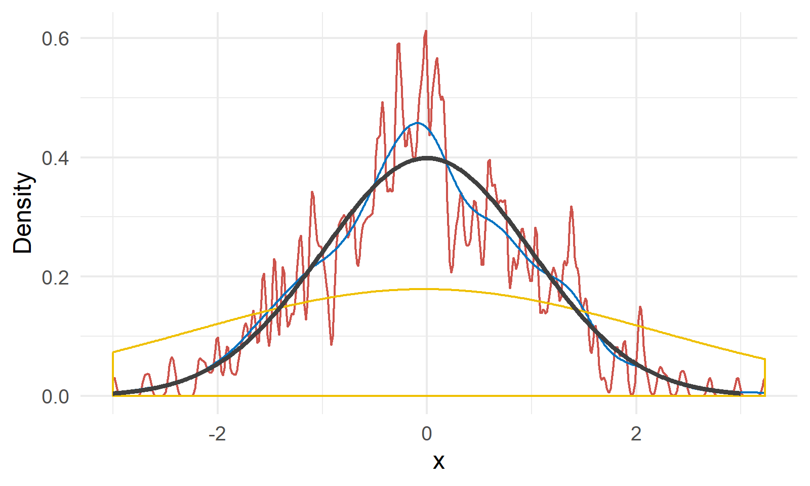
As shown in Figure 3, we have a random sample $X$ of size 200 generated from $N(0, 1)$ shown by the black line4. The red, blue and yellow lines are kernel density estimations with bandwidth 0.02, 0.2 and 2, respectively. We can see a bandwidth of 0.2 gives a relatively close approximation of the true density, and the other two choices are either undersmoothed or oversmoothed.
Many criteria and methods have been proposed to choose the value for $\Delta$:
- Define a criterion for a “successful” smooth. Try a range of $\Delta$ values and see which is the best according to that criterion.
- Use
cross-validationto pick $\Delta$. Split the data set into $k$ pieces, and try to fit on each piece. Use this to get predictions, and pick the $\Delta$ that does well over the cross-validation. - A general rule of thumb takes
$$ \Delta = \frac{1.06\hat{\sigma}}{n^{\frac{1}{5}}} \text{ where } \hat{\sigma} = \min\left\{ S, \frac{IQR}{1.34} \right\} $$
where $n$ is the sample size, $S$ is the sample standard deviation, and $IQR$ is the interquartile range $Q_3 - Q_1$.
According to Wassesman in his book “All of Nonparametric Statistics”, the main challenge in smoothing is picking the right amount. When we over-smooth ($\Delta$ is too large), the result is biased, but the variance is small. When we under-smooth ($\Delta$ is too small), the bias is small but the variance is large. This is called the bias-variance tradeoff.
We want to actually minimize thesquared error risk (more commonly known as the mean square error), which is bias$^2$ + variance, so that we get a balance between the two aspects.
R code used for plotting Figure 1. A shoutout for the R package patchwork!
↩︎1 2 3 4 5 6 7 8 9 10 11 12library(ggpubr) library(patchwork) set.seed(42) dat <- data.frame(x = rnorm(200, 0, 1)) p1 <- gghistogram(dat, x = "x", bins = 10, title = "10 Bins") p2 <- gghistogram(dat, x = "x", bins = 20, title = "20 Bins") p3 <- gghistogram(dat, x = "x", bins = 50, title = "50 Bins") p4 <- gghistogram(dat, x = "x", bins = 100, title = "100 Bins") (p1 + p2) / (p3 + p4)For more graphical representations, see this Wikipedia page. ↩︎
R code for Figure 2 is given below.
↩︎1 2 3 4 5 6 7 8 9 10 11 12 13 14 15 16 17 18 19 20 21 22 23 24 25 26 27 28 29 30 31 32library(tidyr) library(ggplot2) indicator <- function(x) { ifelse(abs(x) <= 1, 1, 0) } gaussian.kernel <- function(x) { exp(-x^2/2) / sqrt(2 * pi) } epanechnikov.kernel <- function(x) { 0.75 * (1 - x^2) * indicator(x) } tricube.kernel <- function(x) { 70 * (1 - abs(x)^3)^3 * indicator(x) / 81 } x <- seq(-1.5, 1.5, 0.01) dat <- data.frame( x = x, Boxcar = 0.5 * indicator(x), Gaussian = gaussian.kernel(x), Epanechnikov = epanechnikov.kernel(x), Tricube = tricube.kernel(x) ) %>% gather(key = "Kernel", value = "Density", -x) ggline(dat, x = "x", y = "Density", color = "Kernel", palette = "jco", plot_type = "l", numeric.x.axis = T)- ↩︎
1 2 3 4 5 6 7 8 9 10 11 12 13 14 15 16 17 18library(ggplot2) set.seed(42) x <- seq(-3, 3, 0.01) true.density <- 1/sqrt(2 * pi) * exp(-x^2 / 2) random.x <- rnorm(length(x), 0, 1) dat <- data.frame(random.x = random.x) ggplot(dat, aes(random.x))+ geom_density(bw = 0.02, color = "#CD534C")+ geom_density(bw = 0.2, color = "#0073C2")+ geom_density(bw = 2, color = "#EFC000")+ geom_line(aes(x = x, y = true.density), color = "#404040", size = 1)+ xlab("x")+ ylab("Density")+ theme_minimal()
| May 08 | Modern Nonparametric Regression | 8 min read |
| May 06 | Bootstrap | 11 min read |
| May 06 | Categorical Data | 17 min read |
| May 05 | Correlation and Concordance | 9 min read |
| May 04 | Basic Tests for Three or More Samples | 10 min read |